Exhibition and Overall Unit Conclusions
April 29, 2013 § Leave a comment
Now that I had all the materials for the space structure, completed the first projection of Gao, could promote the project’s status through various online mediums and had been given the go ahead from AUB, I felt it was time to do a test/proof of concept exhibition on campus the demonstrate the piece prior to the crit and find/iron out any flaws. *The flaws we found will be referenced at the bottom of this post.
For this demonstration I felt it would be important to spend time on the structural design, logistics, projection and layout of the space, and focus less on the interactive element, which at this stage is in no way imperative to the exhibition of the piece. The interactive element of audience triggering is essentially only a means of beginning the projected visuals upon their entry (what is potentially a fairly simple process), yet with the timeframe we had and the environment we were working in we felt it would be a better idea to implement this additional feature once the project was in a more refined and complete stage, post crit.
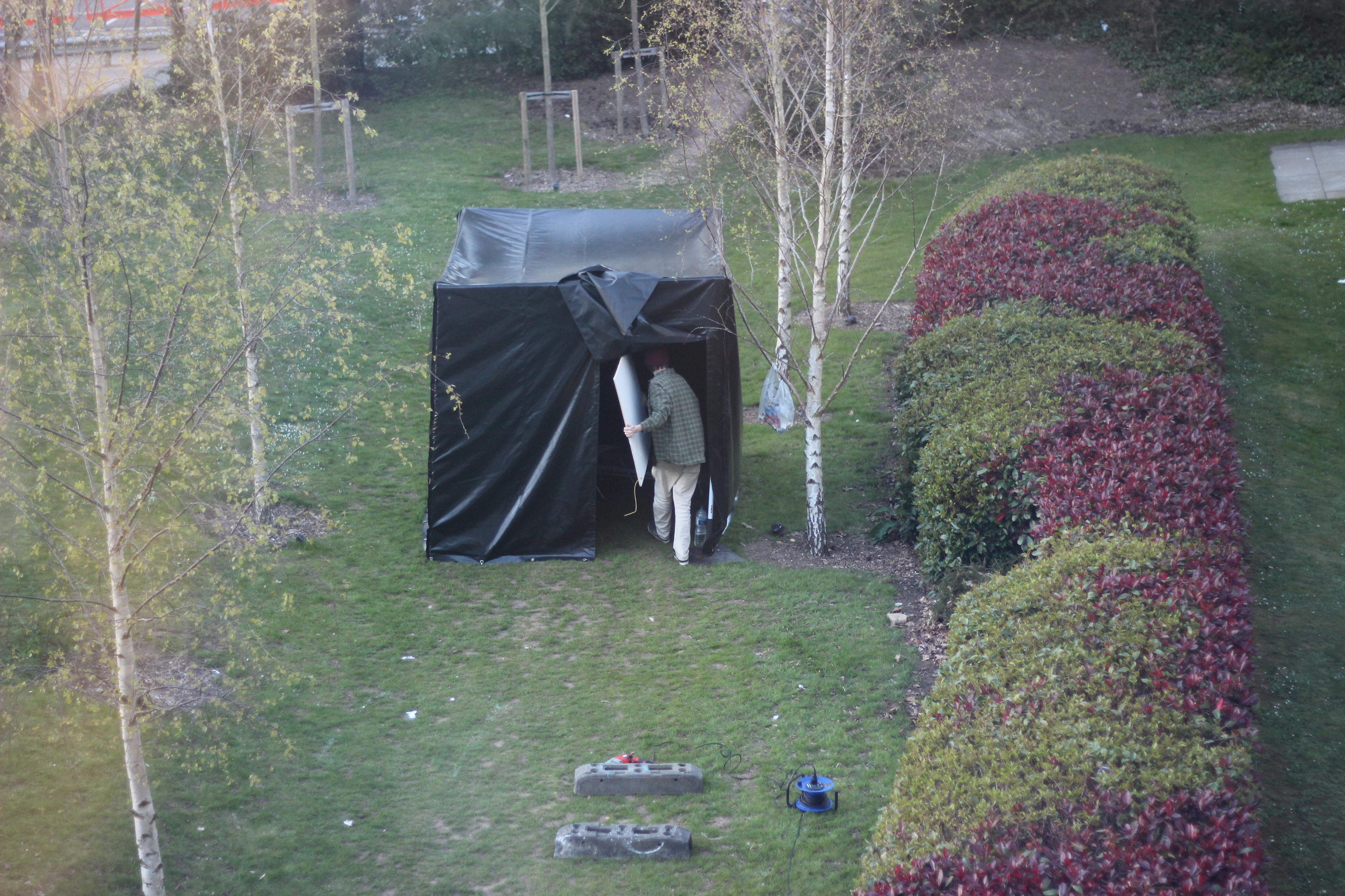
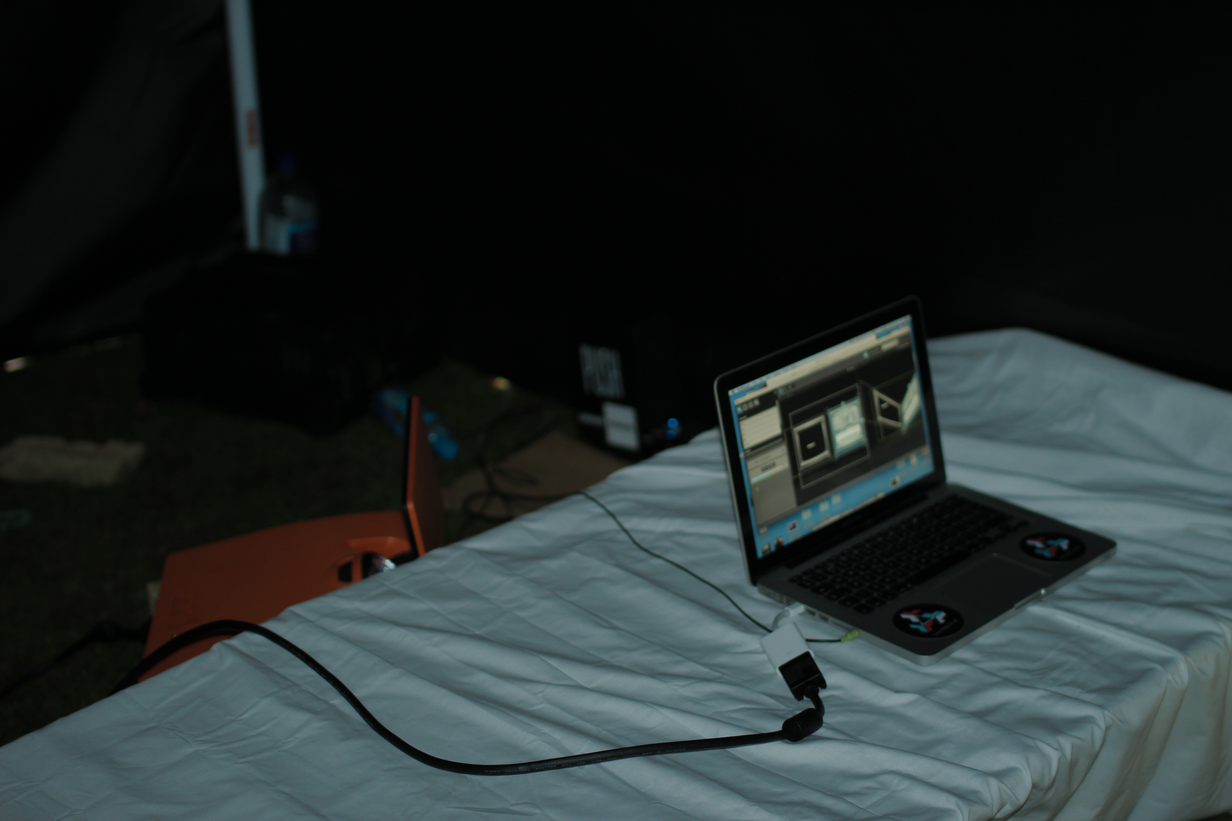
We knew that we would have 3 days to set up, conduct tests and then take down, so with the help of a few friends, I began setting up on the Tuesday in time for demonstration on Thursday’s crit. Having set up the canvas before, I felt I knew the quickest way to do so, but this set up proved that at least an hour must be allowed for structure construction, as even with 4 people it takes a while.
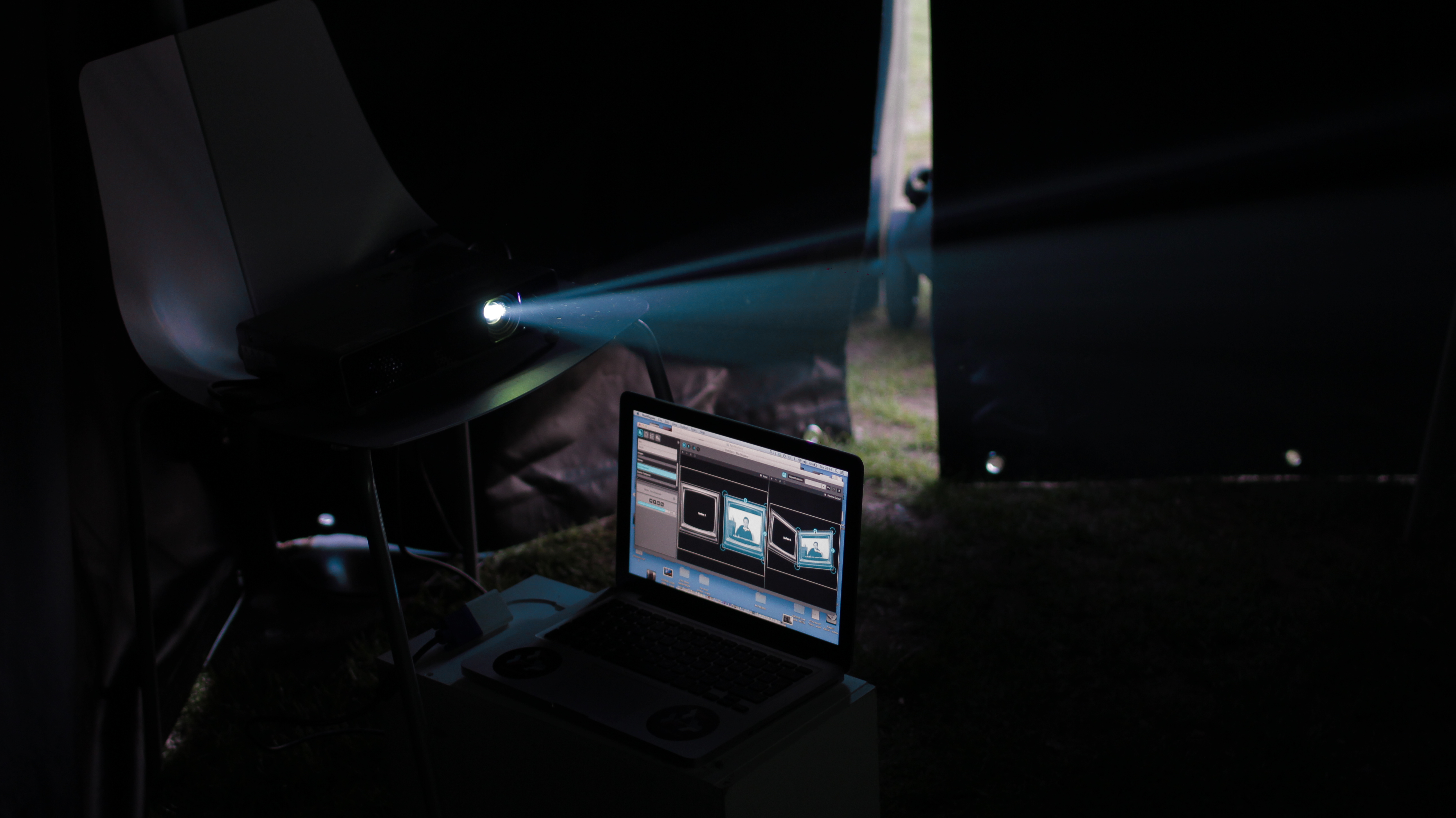
Once we had this basic structure set up and had access to power, we went about trying different projection methods. The first day I tried using a sheet by mounting it to the corner and projecting onto it, however, this idea was eventually scrapped as the sheet not only covered the whole width and some of the length wall (looking out of place), it also crinkled with the unevenness of the structure (*something I will mention later), spoiling the projections and making them hard to read. So, after discussion and further brainstorming about alternative projection methods, on the second day we decided that mounting wooden boards in the corner of the space (on which the television screen visuals would be projected on) would be the best alternative option. However, the boards we managed to source for the second day of testing, although seeming flat, were fairly warped, making the projections distort and again ruining the illusion. So I decided that for the crit day I would measure and cut two solid and straight ply boards, paint them white, mount and project onto them to ensure an even and clear projection. On the third days these were mounted and we could successfully project onto them, however this was not without the trials and tribulations of the projectors.
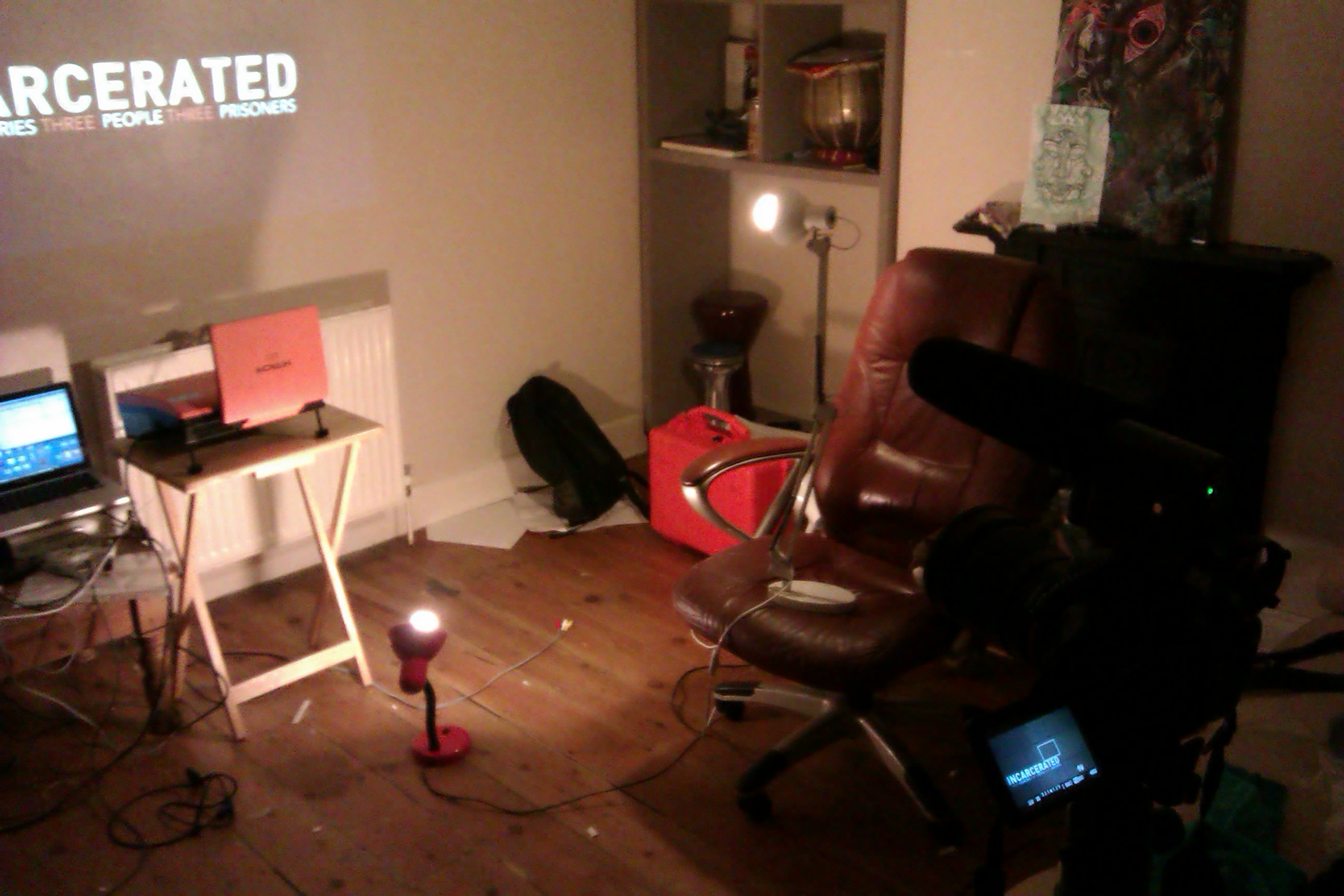
Going back to day one, my primary goal was getting the projector up and running and projecting in the space, sorting out the positioning and housing of it the following day once I knew that it worked. Due to this, when doing the first projection test with the sheet we simply placed the regular throw projector on a chair. However, I had to find out both which projector worked best (short throw or regular) and where it could be placed to keep it relatively hidden. Tests with the short throw revealed that it would have to be too close to the screens (meaning it would have to be in sight) for it to work effectively and project clearly, so I decided that the regular projector would be the best to work with. However this meant I would have to work out a mounting system and a way to direct audience flow to have successful, uninterrupted projection. I decided to build a housing for the projector out of a modified basket and after experimenting with mounting it in different places around the space, the final decision was to mount it with cable ties and bungee cords in the corner above the entrance, stopping audiences getting in the way of the projections by placing the bed diagonally across the space. This was the most effective method of projection, allowing the easiest and most successful mapping and only being hindered by the issues I will list in a moment.
Day 1 (setup of space, projection tests with sheet and video):


Day 2 (projection tests with warped wood):
Day 3 (mounted projector and new wood screens):

Overall, taking into account the purpose of these test exhibitions they were massively successful and proved hugely valuable in helping me understand the logistics and issues when setting up the piece both in and outside of the space. It may not have been the completed exhibition of the space, but that was never the intention of this stage, and I learned a lot of things to take to future exhibitions:
– The structure frame needs more stability: Currently the lengths and corners of the piece are joined and aided by PVC plastic plumbing tubing. However, this is not a viable option as the plastic joins are not structurally sound enough to completely support the weight of the canvas and metal poles themselves. They hold it up fine, but their flex allows for sag in the canvas and thus a less effective experience. To combat this I intend to re-design some alternate joiners (potentially out of standard size scaffolding pole) and/or create strong wooden inner joiners for the length joins. This will then allow for a more secure mounting of a projector and projection boards, as what they will be mounted to (and hopefully in) will be more stable.
– The structure must be built on level ground: We constructed the piece on grass, as we would not have access to flat level concrete for 3 days of exhibition. Additionally to this, if we were to exhibit on hard ground (which work have worked far better) we would have needed to use parasol holders to keep the legs stable and supportive. The fact we were exhibiting on uneven ground (something we didn’t realise until it was essentially too late) was something that not only made the structural integrity of the piece less reliable, but also affected the aesthetics of it. When exhibiting next time, I will ensure it is either on level concrete, etc with support stands/holders, or that it is on perfectly even grass.
– The piece will benefit from not being set up in direct sunlight: One big issue about both this exhibition of the piece and working in it this time, was that it was in a period of very sunny weather, making being inside the black structure very hot and not being a good environment to be working equipment like projectors, which have the potential to overheat. It also effected the exhibition as it became hard for audiences to fully comprehend the message of the projections when in that environment. The intention was for an element of audience discomfort to help physically portray the message, yet this amount of discomfort would only hinder that message. Because of this, in future I will endeavour to exhibit in shaded places, making both the working and exhibition environment far more bearable…
Overall Unit Conclusions:
As the conclusions to this unit were so extensive, I felt the most effective means of documenting them would be through referencing the Learning Outcomes specified in my learning agreement.
LO1 – ‘Demonstrate the ability to rigorously apply specialist knowledge, understanding and creativity in the production of your extended major project.’
There were many aspects of this project which demonstrated a use of specialist knowledge and understanding. Over the course of the unit I gained and applied knowledge of project funding methods (techniques widely used in professional practice), social network promotion (starting up a Twitter and Facebook page), knowledge of softwares (learning the fundamentals of Module8/MadMapper and furthering my knowledge of After Effects and Final Cut Pro) and advancing my application of logistical understanding, organisation and problem solving (doing all the necessary pre-production work, sourcing all the equipment and materials, successfully creating a space which can house the piece and organising a test exhibition). As for an application of creativity, I feel that this has been demonstrated through the creation of an image for the piece, aesthetically considered audiovisuals portraying the necessary themes and a creation of an immersive space to exhibit them.
LO2 – ‘Demonstrate the ability to manage the complexity of practice demanded by the extended major project by managing your time and work efficiently.’
I feel that managing a project solo which would be far more suited to a group of people (having to split time into each area of pre/production), made me take strong consideration over my time management. Taking on all of these roles helped me understand the importance of giving each stage necessary time, and the timeframe I worked too proved successful, as a proof of concept exhibition was managed by the end.
LO3 – ‘Demonstrate ability in the coherent use of various representation techniques, documentation and presentations to specialist and non-specialist audiences.’
As the piece was meant for relatively universal audiences, its design, promotion and audiovisual content had to cater to both specialist and non-specialist audiences, the Facebook/Twitter page for example was designed and delivered taking this fully into account. Much time was also spent over the treatment document to ensure it was not too specialist for general audiences so that they understood, yet still portrayed the necessary information for specialist readers. Most importantly however, the themes that the piece portrays about the human rights cases studies is trying to bring specialist human rights knowledge into the public knowledge via audiovisual and immersive means, as that is the aim of the project and it’s raising over awareness.
LO4 – ‘Demonstrate your awareness of the ethical, social and cultural issues appropriate to the concept of a responsible professional practitioner, whether working independently or as part of a team.’
There were vast ethical, social and cultural issues when working on a human
rights project such as this. Care had to be taken to try and ensure the wishes of the families involved were respected. Because of this, contact with relelvant human rights organsations was very important. Through phone contact with groups like Amnesty and BurmaCampaignUK I was directed in the most appropriate and helpful way to represent these political prisoners, and will continue correspondence with them to ensure this in future. A responsible attitude was also very important when deciding themes portrayed within the space, being careful not to be too outlandish and affecting certain association with human rights groups.
Overall, this unit has been massively beneficial for the project and I feel that I am at a stage now where the piece is almost ready for full exhibition. Over summer I will refine and add elements to make the piece as successful as possible, and exhibit when and when I can. Furthermore, my decision not to implement interactive elements and focus more on structural design, projection and logistics for this unit stemmed from a need to successfully demonstrate the piece prior to the critique. After tests of the themes and messages that the piece portray, I found that they worked well in the space, so interactivity was not an imperative for the demonstration, it would only a minor benefit that took a lot of time. Thus, I felt that in future I may implement developed interactive elements, as the process within MaxMSP or through a MIDI trigger would be very similar to that of *Forest Floor. Nevertheless, for the time being the piece as a medium for portraying an audiovisual message in an experiential environment is, I feel, strong enough.
The Design of Promotional Material
April 29, 2013 § Leave a comment
Once the project is ready for legitimate exhibition, a hugely important element will be its promotion. A vast amount of this promotion will be online, announcing dates and sharing via social networking like Facebook and Twitter. However, there will have to be an element of print based promotional material such as flyers and posters that will be created to promote the project outside the immediately accessible demographic and reach of the online mediums.
Thus, in this unit I felt it would be a good idea to create a mock-up leaflet/poster template to use for promotional purposes, to be printed once further dates of exhibition had been announced. I spoke to Jack, the graphic designer who had helped me create my treatment document, and we discussed the included information and aesthetic direction of the promotional material. After drawing up a basic concept and text blurb/content for the leaflet, we began work on the first draft. We decided that the aesthetic direction should follow on with that of the treatment, sticking to the same white/orange on grey colour scheme and typefaces and being overall quite sparse, simple and yet eye catching. We drafted designs with and without the use of the flags of the represented countries, yet eventually decided that without was the most aesthetically pleasing as it stuck to the simple 3-way colour scheme. This was the completed first draft with all summarised project info, only lacking exhibition dates that I will include as soon as they are arranged:

Once I have more finalised exhibition dates I plan to print a selection (100 or so A6 leaflet size and a couple A4 and A3 for posters) of these at the enterprise pavilion and place them around both Bournemouth and Brighton in fitting venues which would hopefully attract audiences. This would include placing leaflets and/or posters around AUB, BU, in student venues such as the Drop Project space, at the Brighton Dome (where I work) and in venues and cafes around Brighton, all to help in gaining audiences to help raise awareness for the cases I am representing.
Visual and Narrative Format Development and Creating the First Projection
April 29, 2013 § Leave a comment
The projections for the piece were always going to be the most important aspect of the audiovisuals and the primary means of portraying my messages to potential audiences. Their goal would be the education of audiences, whilst also having aesthetically interesting and emotive elements in order to be successful overall.
Knowing that we would be using a basic context and format of television (portraying the ‘media we don’t see’ and projecting content through virtual TV screens), I thought it would be important to tie in the projection content with that. However to begin with, I felt I should look at some other projection art and audiovisual content to gain some inspiration for my own.
This is an online Broadcast discussing Chinese politics and human rights, directed at who I assume to be a primarily young, English speaking audience, due to it’s contemporary, YouTube style comical delivery . It helped me understand how to promptly yet successfully portray an informative narrative, appealing to a universal audience:
This was a short video for Amnesty International, projected as part of their 50 year anniversary campaign. It demonstrated to me the power of portraying hard-hitting human rights themes when attempting to promote prosocial action in audiences. I was also very inspired by it’s poignant use of colour grading and atmospheric sound.
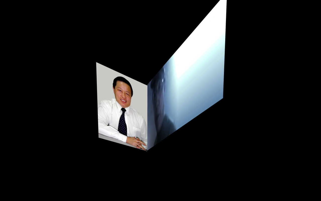
Once I had looked into this other video and projection art for inspiration, I could begin the creation of the first projection video (representing Gao Zhisheng), creating a format that I could use for the other two visuals. However, although conceptually considered prior to the creation of the actual projections, the projection format had to be considered a lot when making the Gao projection to ensure it and the others would be successful.
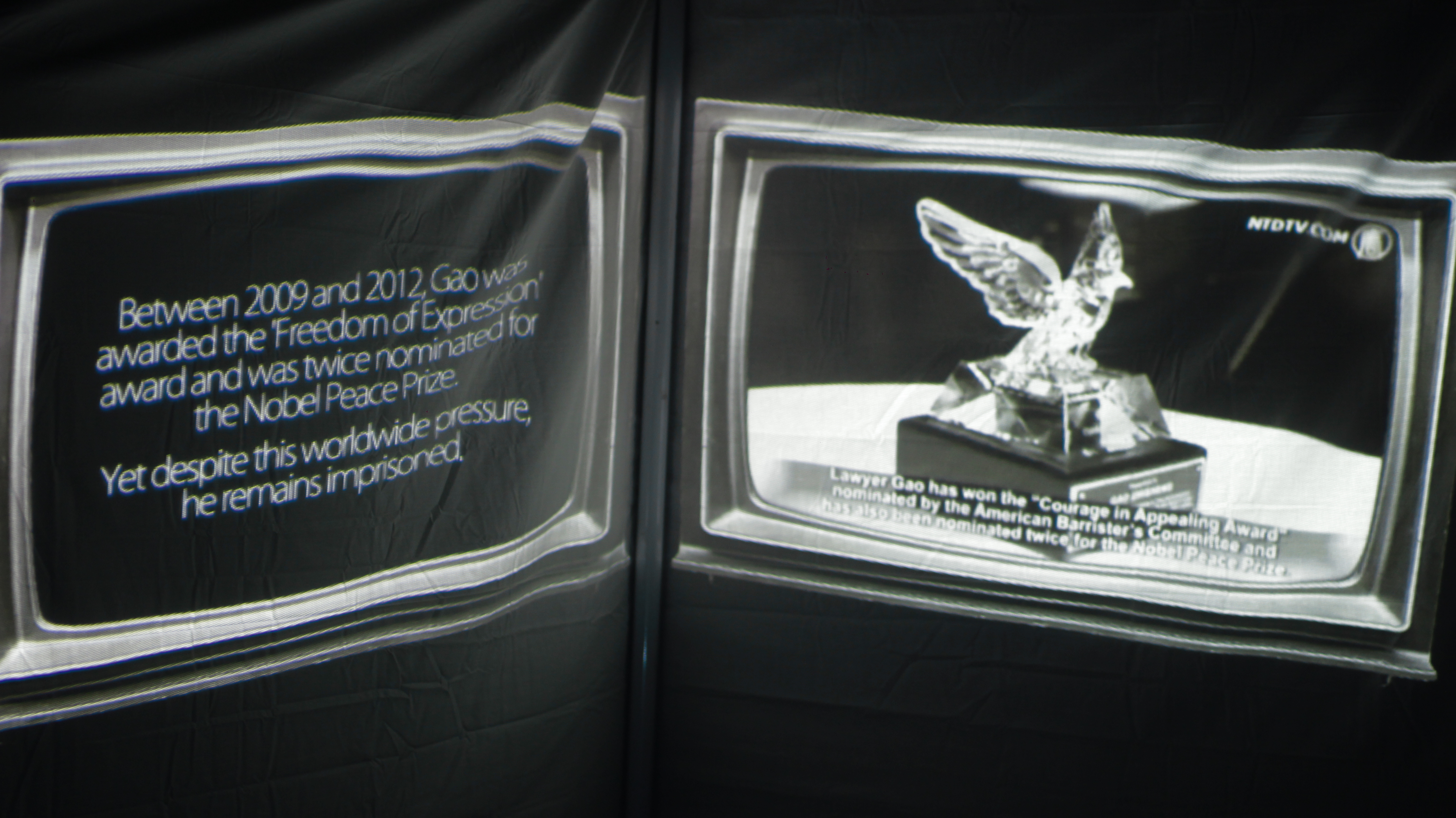
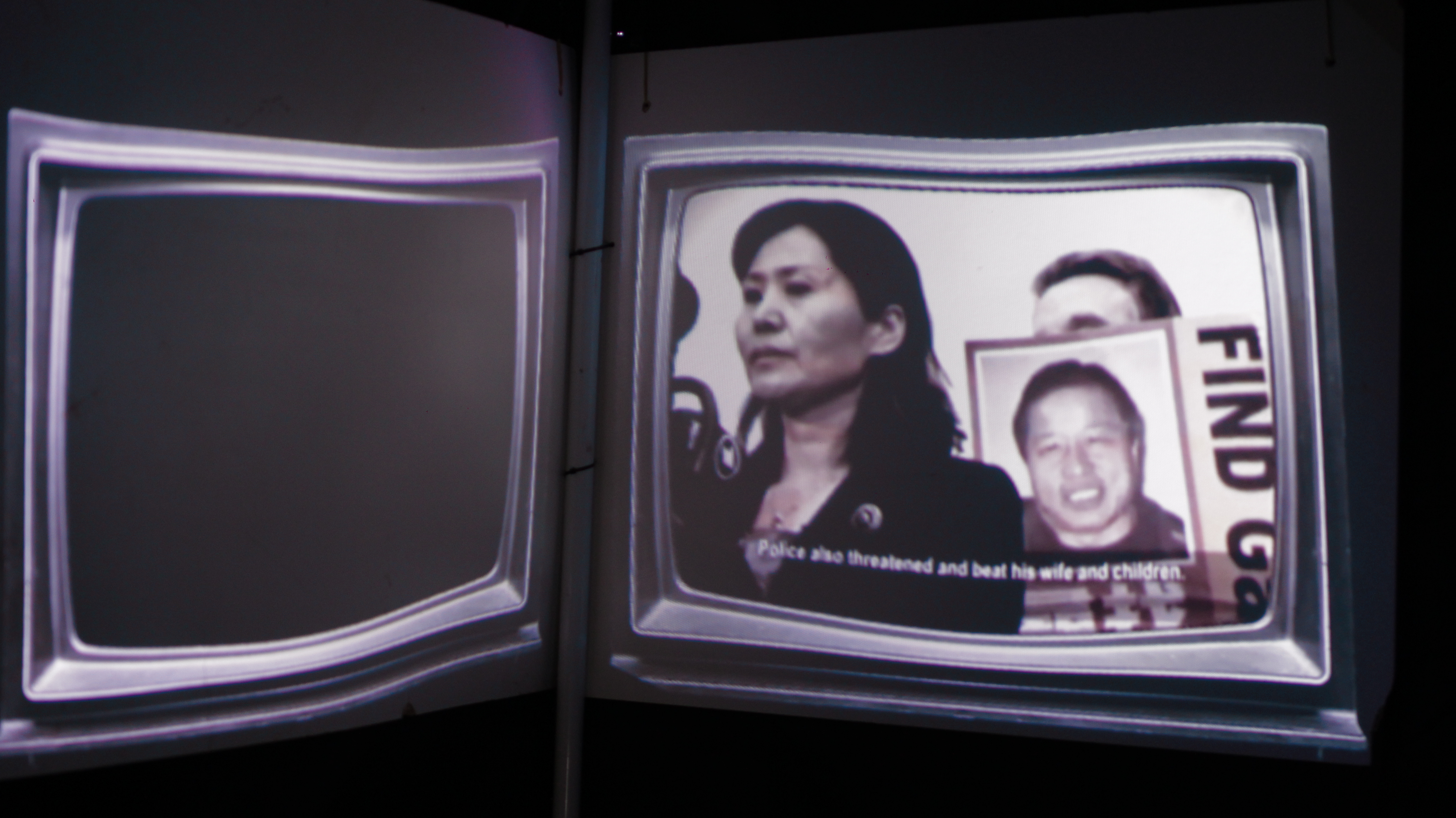
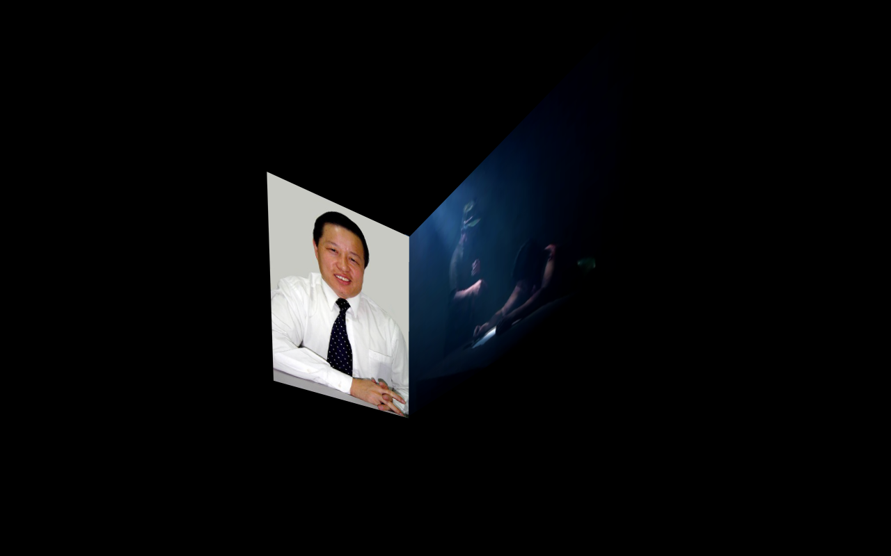
Firstly, as I knew there would be a 90-degree corner mapped projection of two television screens displaying alternate yet corresponding videos, I had to decipher how this format could be utilised to successfully portray a narrative. I felt it important that the two screens did not portray the same media as that would render the dual screens unnecessary, instead I felt one should portray a textual description of the story being represented, whilst the other supported and gave visual examples to create a more universal narrative. So for the Gao projection (the first projection I would be creating and portraying in my test exhibition), I decided to create a series of 10-15 second titles in Adobe After Effects, narratively describing Gao’s whole story in a summarised manner and describing ways audiences can actively involve themselves, which would then be cohered to with visuals on the adjacent screen. I planned to then bring these into Final Cut and edit my corresponding videos alongside, ensuring their timing synched up. Also, Keeping with the media (and what would become broken broadcast) theme, I made certain aesthetic decisions in this AE titles stage, such as the addition of subtle static a light blue glow to emulate old television monitors (this can be seen in the final projection render below).
I then had to create the corresponding narrative to these titles, and in accordance with the ‘media we don’t see’ context, I felt a good idea would be to portray these stories through media formats such as documentary and news report references, creating an additional and factual narrative purely from different media representations. To do this for the Gao projection I looked into his representation in the Chinese media, but found that (unsurprisingly) in the national communist media he had no representation. So I then looked into more underground Chinese broadcasting and came across an online news broadcaster called ‘China Forbidden News’ which portrayed stories that the CCP government would not represent, such as human rights abuse cases like political imprisonment. Due to the high profile nature of Gao’s case this meant they had an archive of broadcasts referencing his case, condition and developments. As the CFN channel is a not-for-profit broadcaster, they welcome promotion of their content, however there were no English speaking contacts that I could get in touch with or online privacy policy I could read to find out whether this policy covered the download and use of their material. So I sent a message to their YouTube page to ask if it would be acceptable to use their content to represent Gao’s case but had no response. Ultimately, as my piece is also not-for-profit and I will gain nothing from using it, I decided that I would use their content and if I got a response telling me not to do so I would re-evaluate and re-edit my projections accordingly.
Thus, I constructed a narrative in Final Cut (alongside the titles I had created) using the archive of Gao new reports, using keyframed application of downloaded plugins, colour grading and sound effects to create an aesthetic of broken broadcast while portraying Gao’s story in a manner which would make sense to an uninformed audience. Also, to ensure that the audience would not get bored (taking into account that they would be watching this projection standing in a small, dark space) I made certain that the full projection didn’t last more than 6 minutes, a rule I will apply to all my projections to ensure audiences stay interested.
Once I had created this first edit, I then had to decide on a style of Television and place them over the two corresponding videos. After looking into a selection (trying to find universal ones, easily recognisable as televisions), I found a royalty free image of an old television, split and mirrored the screen in photoshop (to remove the dials at the side), removed the screen and background from the layer and exported it as a .PNG, meaning I could simply place the image over the footage and scale it to size without having to key anything out. Once I had done this, the first edit of the Gao projection was complete and I showed a few friends to see how they felt about it. The general response was very positive, especially from those helping out with the project, so I rendered it out and this is the final result (which would be split and mapped to the corner of the space):
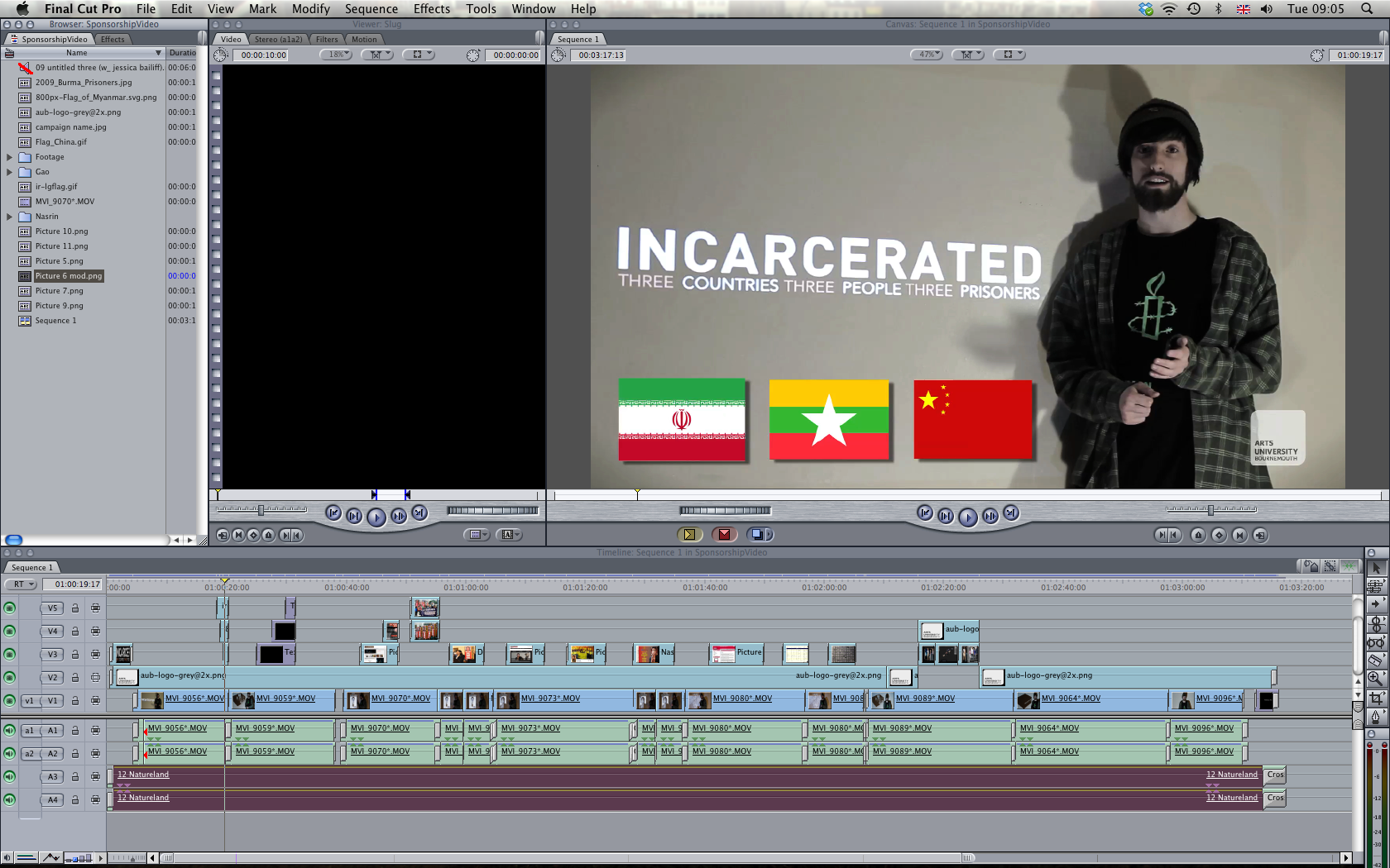
And this is a screenshot of the Final Cut editing timeline:

The process I used for this Gao projection may be slightly different with the other projections for Tun Oo and Nasrin, but having a general narrative structure and format will help in the creation of the other projections and keep all three (and thus the whole project) aesthetically and thematically consistent. Due to time restrictions I will only have the Gao Projection to show for the crit, but now that I have a structural theme for the others their editing process will hopefully be much quicker as they will not involve the amount of idea development and brainstorming that the first inevitably did. Overall though, I am very happy with how this final render turned out, it how it looked when map projected onto the corner of the space and I look forward to making the rest of the projections in the coming weeks in time for future exhibitions.
Sourcing Materials and Construction
April 29, 2013 § Leave a comment
After the long process of project conceptual development (deciding that having a canvas built for the space would be the most practical option for the piece), the sourcing of materials and construction tests were the following stage.
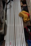
Fortunately, before committing to having a canvas made (also helping me in the decision to do so), I happened to come across 12 metal poles (initially used for goal posts) that I could use for the pieces frame:
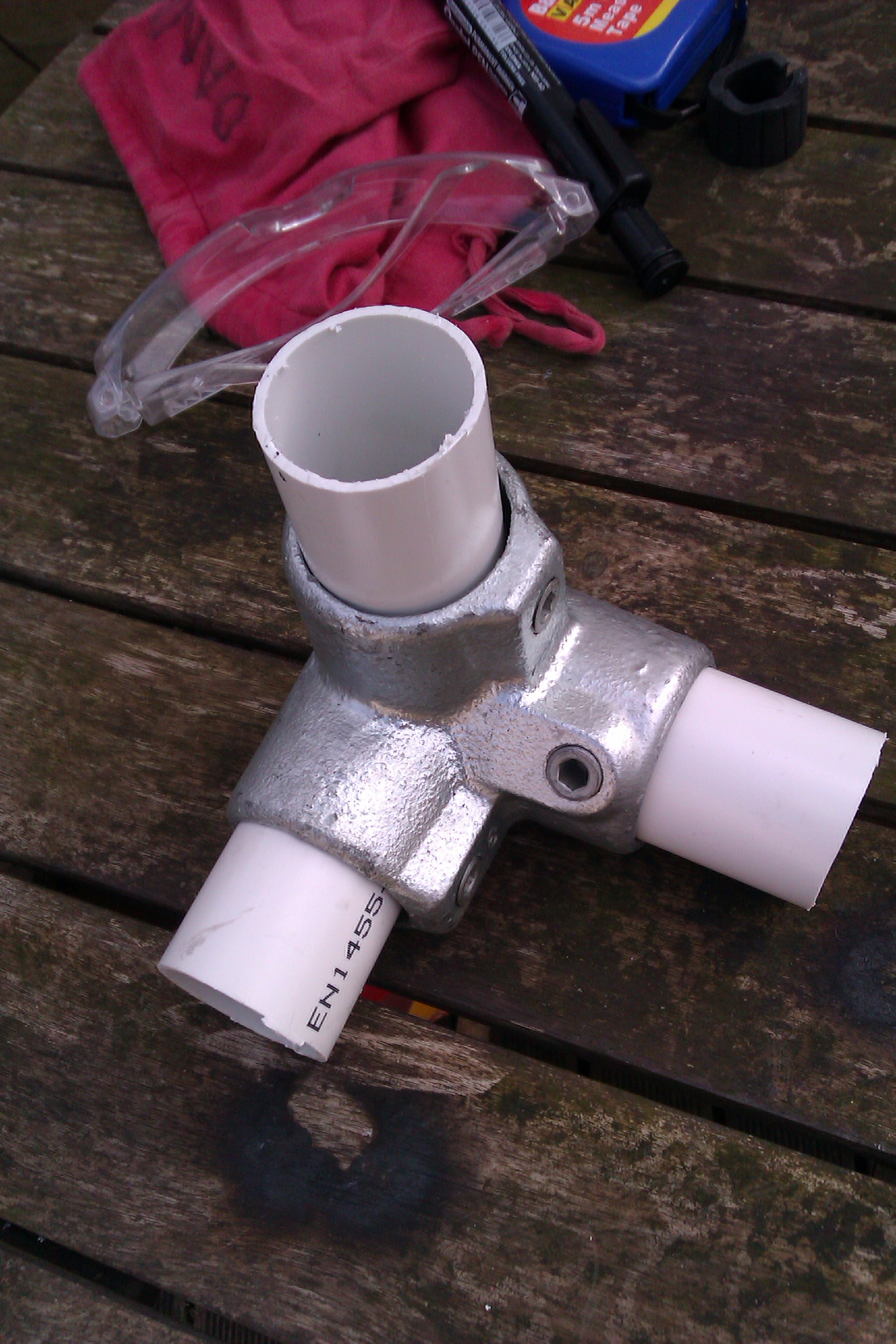
However, this would mean that I would have to buy or make 4 joiners for the top corners of the frame to keep it together. After many discussions with Liam and others we decided that despite the poles to being typical scaffolding size (38mm rather than 42mm), buying joiners and adding additional fittings to fill the gap would be the best and most practical option. After extensively researching these ‘3-way 90 degree 128 corner elbow clamp’ joiners over the internet to find the cheapest one, I final settled with an order from ‘Interclamp Fittings’. This is the quote/invoice for them and images of them attached to the poles using PVC plastic tubing for the fittings:

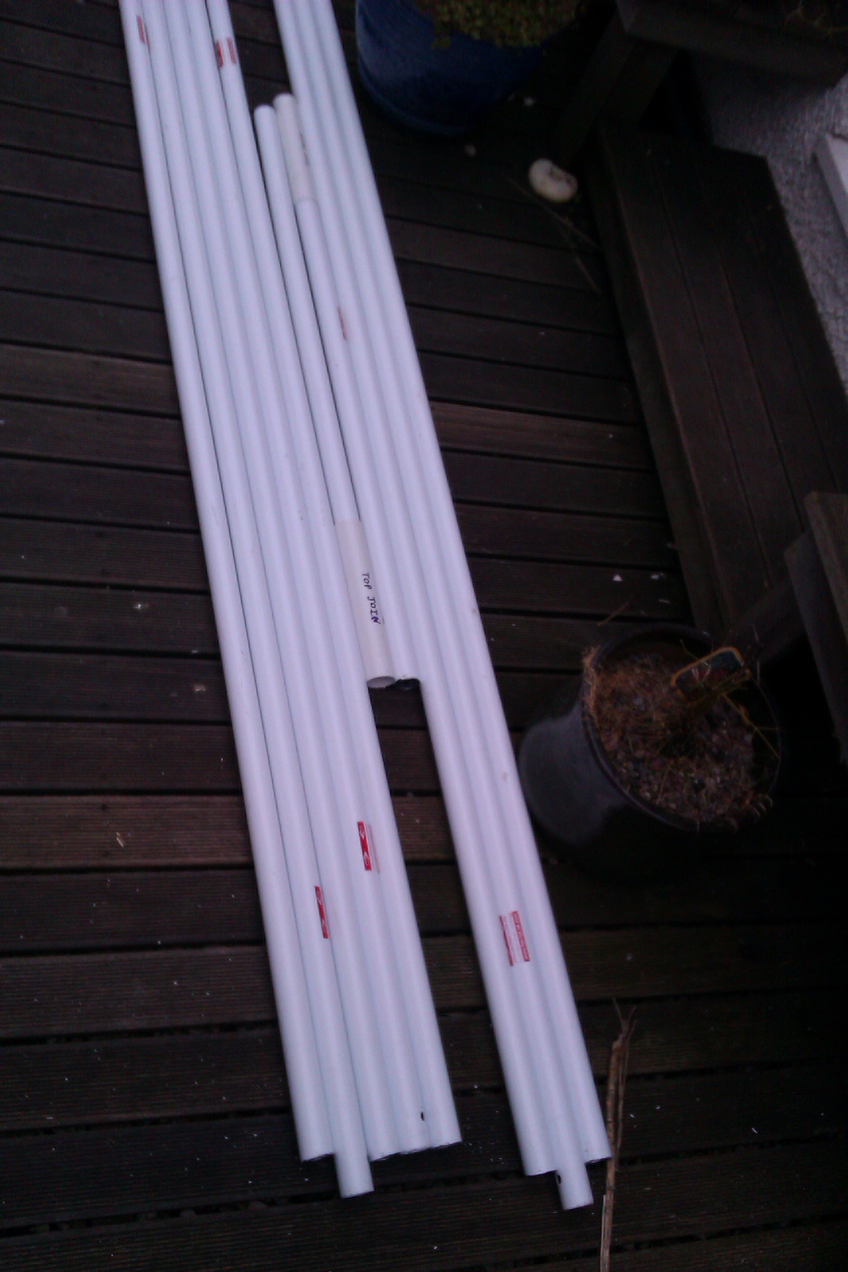
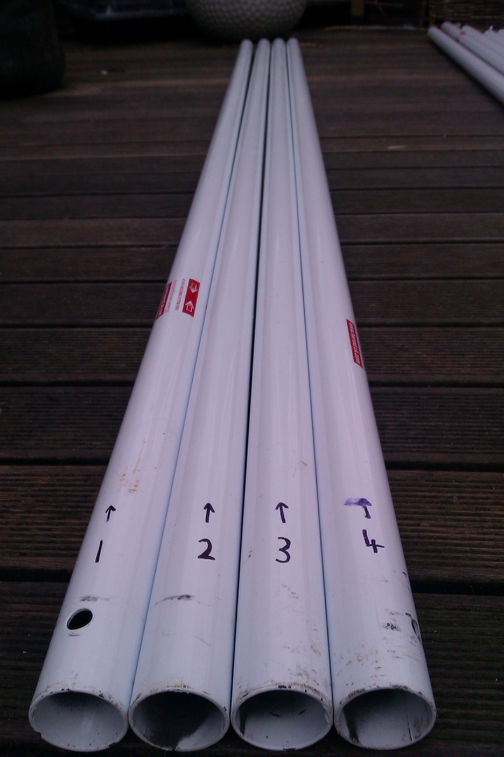
Once I had these I could move on to creating the frame for the piece, ensuring it is the right size and then taking measurements for the made-to-measure thick, water and lightproof canvas tarp housing I would be having made for it. I constructed a basic frame by cutting 8 poles down to 220cm using an angle grinder:

Then, using PVC tubing as joiners, I made extensions for the poles from the longer sides of the frame and joined everything with the joiners and fittings:

Once I had this basic frame structure constructed I took down specific measurements ensuring they were exact and down to the centimetre, in order for them to be sent to a tarp/canvas company. The measurements were;
Height 230cm x Width 230cm x Length 324cm
It was then down to researching canvas companies who could construct a box to these specifications with eyelets at the bottom (spaced by 50 cm) and a Velcro doorway with these specifications:

After researching a few, the cheapest I found within the UK who could fit all our requirements was a company called ‘Cunningham Covers’ and after a fair amount of correspondence, this was the final quote for a cover with everything we needed:

It was then a matter of finding funding for this cover, hence the set up of my project-funding page. I also looked to university to see if there was anyway they could help me out, and fortunately they were willing to contribute a sum towards this made-to-measure canvas. Through this I was able to purchase the cover, which would be waterproof, lightproof and portable, allowing me to exhibit almost anywhere and anytime. This is the delivery package of the canvas:

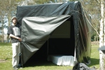
And this was our first erection of the space in our garden, with a projector also set up inside to test lighting and projector range without a projection screen (not pictured):
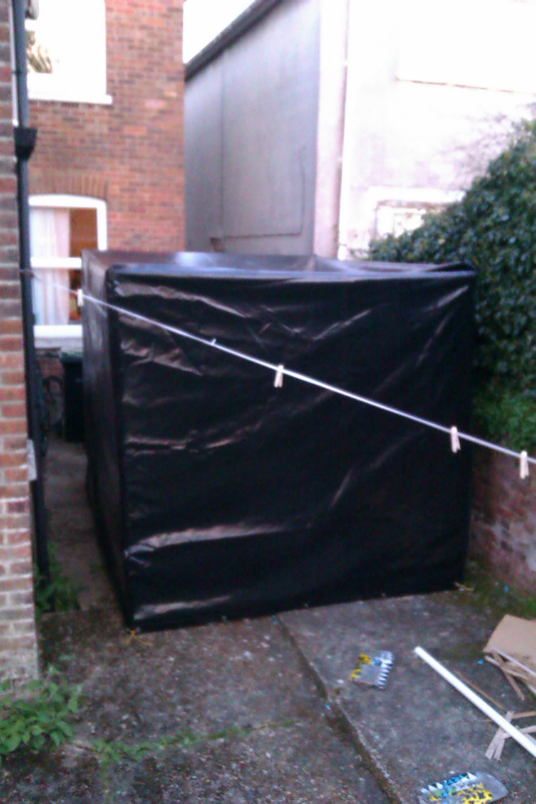
This set up was successful, so we planned to arrange a test exhibition on campus (shown in previous blog post) to demonstrate the piece in action in its most basic form.
It was then important to move on to the aesthetic elements and items that would be used within the space, the first one being the bed. The bed would not only be and aesthetic item representing the space as a prison cell, but would also have practical properties such as directing audience flow (keeping them from standing in front of the projections) and hiding the technical equipment like speakers, laptop and wiring. I felt that the bed, despite having these functional properties, would also have to look the part, so I thought an old, shoddy portable camping bed would work well as it is the most stripped and unluxurious, helping represent the imprisoned plight of our case studies. I thought that the best place to go to find something like this would be a car-boot sale or second hand furniture warehouse, and visited a few in the hope of finding one. Eventually I came across one for only £10 that fit the old, beaten aesthetic I was aiming for:

Another aesthetic element was the projection screens and what we intended to project onto, whether we cover a corner with a sheet or mapped specifically onto two corner mounted screens. We initially did tests within the space mapping onto a sheet but it was very difficult to keep the sheet perfectly straight, ruining the illusion intended from the projections. Because of this I decided to create two wooden boards that would be mounted at 90 degrees on the corner of the space, allowing for a straight surface to map onto that could be covered in each projection, helping with the illusion of actual TV’s. I cut a piece of ply down to measurements of 90cm x 120cm, painted them white and did mapped projection tests onto them, helping us conclude that for the time being this would be the most effective means of projection.
It began apparent during this stage that the aesthetic elements of the piece were much more stripped down than in the initial idea of the piece, but this may develop as the piece progresses. Nevertheless, all these construction tests were vital in the progression to exhibition stages, and once they were complete the piece was ready to be test exhibited on the AUB campus.
Project Funding
April 29, 2013 § Leave a comment
Understanding project funding applications and sponsorship is vital in the professional environment I intend to enter into, as often I will need to find way of funding ideas an projects in order to bring them to life. With this project I had initially intended on spending as little of a budget as possible, but as it progressed it because clear how spending nothing would be an impossibility so I began looking into ways of funding the project. One option I looked into was sponsorship from organisations or companies to help me obtain materials and venues I would need. However after looking into this it was clear that the project was not at a developed enough stage for substantial sponsorship, and that it would have to be exhibited first in at least a proof of concept form to successfully visually demonstrate the piece in action.
I then moved on to an alternative fundraising concept; project funding websites. These work through people pledging towards your proposed project and upon reaching your target in your time frame you acquire the money. I researched a few and came across one based in Bristol called Sponsorcraft, specifically aimed at funding student projects. Once I had decided that this was the project-funding site I would be using I began looking into making a page. The page had to include a description of the project, a biography of the artist (me), pledge tiers with rewards and it was advised that I also create a video for the page to portray the project clearly and visually to audiences in order to raise my target. I began by writing the bio (which can be found by following the link to the page) and then followed that by writing up my pledge tiers with incentive rewards, gradually getting better as the donations rose:
![]()
![]()
However, these aspects were not the most extensive parts of this fundraising, as making a video was massively important to represent the project to audiences. I spoke to Rupert about helping me shoot this video and we decided that we should try and reference the visual aspect of the project by projecting images on to a wall next to me (making the video much more interesting to watch) as I talk to camera describing the project and the necessity for funding. So I created a set of projections to tie in with what I would be saying, we projected them next to me, lit the ‘set’ (something I had not done prior, educating me about set lighting) and I read off a cue next to the camera which I had written which described all the necessary information about the project:

Once we had filmed this video, I edited it together in Final Cut Pro, paying attention to ensure that the sound was fine, the colour grading and editing was both aesthetically pleasing and continual throughout, and that the video made sense to somebody unfamiliar with the project, hopefully encouraging them to pledge towards it. This is a screengrab of the editing timeline in FCP:
This is the final Vimeo video:
And this is the link to the final Sponsorcraft page:
https://sponsorcraft.com/p/incarcerated/
Creating this page was great professional practice as this may be something I will have to do in future for other projects. Managing and sharing it is and will be a continual thing until late May if I am to reach my goal, but if I do it will be massively beneficial to the project overall.
AudioVisual Development and Tests
April 29, 2013 § Leave a comment
The conceptual development of the audiovisuals and their utilisation/placement in the space was always going to be a fundamental aspect in how successfully the messages and themes of the project were portrayed to audiences, especially considering the seriousness of the subject matter. However, they also had to be visually interesting to the viewer as opposed to purely informative.
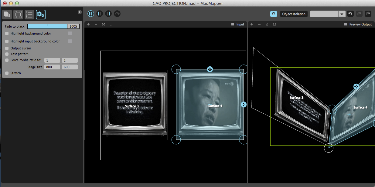
Taking into account the conceptual development of the audiovisuals (using 90 degree corner projection of two televisions), I had to do a series of tests to get to grips with projection mapping software, ensure these conceptual ideas worked and to see whether they would be effective in a small space. I spoke to Rupert, a friend of mine familiar with projection mapping, to see if he could help me understand Module8 and MadMapper and show me the most effective way of corner dual projection. We set up the projector, mapped out projections on to a corner with Madmapper and documented the results:


Screenshots of the corresponding MadMapper/Module8 project.


This test demonstrated that it worked well having two corresponding visuals and the corner placement meant the plain of viewing was easier to comprehend (it was easier to see everything together when mapped to a corner. Also, when the projections were televisions, we would be able to split them into two separate projections and map them to specifically sized screens, positioning them as necessary, giving us more aesthetic freedom than if they were purely just the projected visuals which may look out of place if not joined at the edges.
These tests also helped us in early decisions about projector placement within the space, as we would have to house the projector in a concealed area so as not to ruin any illusion. Our projector for these tests was not a short throw, and was placement across the room (about the distance it would be in the space, and this worked very well. However, we also did tests with a short throw projector, but we found that a short throw would have to be placed on the floor of the space and would most likely be in plain sight. This helped us conclude that not only would a regular throw be more suited due to its size, it would work more effectively and could be mounted and hidden in a corner of the space.
Another aspect of the audiovisuals was the audio element; the ambient sound and how sound would be amplified and travel in the space. Rupert and I agreed that some ambient atmospheric sound would work well very well in the space and help alongside the visual element of the projections, but this was primarily dependant on whether the audio track was suited or not. I knew a few people who made interesting ambient soundscapes (Tom being one), but after looking into a few other people, I asked an old friend of mine Elliot Hurst if I could use his 10-minute ambient track ‘Madwoman in the Attic’, as its dull ambient soundscape would fit well as a soundtrack for the projections and help to create an atmospheric environment in the space.
Venue Brainstorming and Organisation
April 29, 2013 § Leave a comment
A hugely important part of this unit was always going to be the research and organisation of in and outdoor venues for exhibiting the piece, regardless of whether these exhibition dates fell outside of the timeframe of the unit deadline. Because of this open-ended timescale, exhibition was and is not limited to Bournemouth, and I could dip into my contacts in Brighton or even Bristol to try and exhibit there as well.
At first the important thing was to brainstorm general exhibition ideas and then follow each up accordingly:
- On campus exhibition: The AUB campus was somewhere I felt would be a good place to demonstrate the proof of concept exhibition for the project, as it would be local, free, give me access to all the necessities for an installation and could demonstrate the project first hand to the lecturers during the critique stage. However, after talking to George at the student union, it was discovered that this would mean getting set up permission from head of estates, Brian Wheatley. This was the email I sent to him, and after speaking to him in person he was happy for me to do a test set up nearing my critique date:
![]()
Additionally to this, Phil mentioned the possibility of doing an exhibition during the end of year show, giving the project time to be refined and tested prior.
- At the recently opened ‘Drop Project’ university run gallery: After talking to George at the student union about exhibition ideas, we briefly spoke about the student union run gallery he had been working towards for the past few months and the potential of an indoor exhibition there. The main consideration to be taken into account for this however, would be that ‘Incarecerated’ would have to be running alongside a lot of other art pieces to fill the space, yet these pieces would all have to portray similar themes in order to not seem out of place. Put simply, ‘Incarcerated’ would only really fit in the space if a cultural, or human rights based show was being exhibited there, but until then it may not be suited. Nevertheless it would be a free and local venue to use in a good location, so George said if there were any suited shows he would let me know.
- In Brighton, during and after the Brighton Festival and Fringe: As I’ve lived in Brighton most of my life, I’ve fortunately managed to gain a lot of contacts there and am familiar with some of the many small venues scattered around the city. However, during the Brighton festival the typical year round art exhibition format changes with open houses and spaces not necessarily designed for art exhibition popping up throughout the city. This led me to the idea of either exhibiting in an open house format (using the garage of my parent’s house) or researching small garage sized venues or rooms around the city that would work well for exhibition. After discussing this with my dad, he was interested but said that exhibiting in the garage would probably have be a last resort as there would be a vast amount of stuff to sort before it would be empty. This led me to researching small, cheap or free venues and talking to people who knew a lot about the city’s opportunities. Through my older stepbrother Rich who runs a youth art education project, I was put in contact with James. James part runs both the Brighton Fringe and the Sussex division of ‘somewhereto’, a website designed for finding free exhibition locations in the south for 16 – 25’s to exhibit their projects and pieces. Rich forwarded my message and proposal to him and he promptly got back to me with this email:
![]()
This was a massively positive response and a great contact to gain for the future in terms of venue organisation, etc. My correspondence with him has continued over the past few weeks and we are currently in the process of arranging a small, indoor and hopefully free venue space for me to exhibit the project in between the festival dates of May 4th and June 12th.
I plan to consider many other venue ideas of the course of the project’s development, but for this unit and the stage it is currently at I felt it would be a good idea to stick to these venue potentials for the time being. A festival run is still an idea being considered, but I felt that it might be a much more successful idea if the project is at a refined and complete stage before it is put to audiences of that scale, because currently it would not be ready for that environment. However, the longevity of the project allows us to exhibit in smaller venues throughout this year to test the project, iron out the flaws and refine it to a stage where it maybe ready for a festival run in 2014.
Correspondence with Burma Campaign UK and Amnesty International UK
April 29, 2013 § Leave a comment
After sending out emails to most of the relevant organisations, the main ones being BCUK and AIUK, I knew that the wait for their responses might be a long one. However, after a few weeks of waiting, I got a response from the Amnesty activism department:
![]()
This was a positive and helpful response, however, the length of the wait for it made me realise that it may be more practical for me to contact them more directly and over the phone. I needed some extensive information, input and to describe the project in detail, so I endeavored to contact these charities by phone as I felt this would be a much more effective means of communication.
I started by contacting Burma Campaign by phone to find out the best means of aiding the political imprisonment in Burma, as well as talking to them about their perception of my intended representation of their struggle and whether, in their opinion, it could be successful. Through speaking to one of the campaign leaders Zoya, I was put in contact with and spoke on the phone to their head of fundraising, Doug Janke. Doug suggested that a more factual approach might work well with the themes of the project and could prove successful in portraying Burma’s political imprisonment issue. He also said that he could provide an assortment of campaign publications, petitions, letter writing frame envelopes, etc to help me accommodate the aiding of the Burmese political prisoners and to let me know when I was exhibiting so he would know when to send me the up to date materials. This was massively positive and I arranged to contact him as soon as I had dates set for exhibition.
I then moved on to contacting Amnesty as they represent both Gao and Nasrin, would be likely to be able to help me find out more information about them and enlighten me on the best means of helping them. I began by becoming a member of Amnesty (something I had been intending on doing for a long time), through which I was given a customer support line I could use to get more contact information from inside the organisation. Similarly to the email response, the advice I was given was that to find out more information about these specific cases I could contact the international secretariat (Amnesty’s information centre). However after emailing them with no response I felt calling may be a more effective option. After speaking briefly to the Amnesty IS about the project, it’s aims and who I was representing, they recommended I keep the project relatively factual and universal as this was an effective technique installation projects they had dealt with had used before, and said that due to their busyness it might take them a while to get back to me about the specific case studied, etc, but that they would endeavour to find the best ways for me to help with the project. If it comes to exhibition and I have still not heard from them I intend to get back in touch.
Overall though, this early communication with these organisations was massively valuable and helped me understand effective means of representing these political prisoners through the project; focusing on a clear-cut and factual representation of these human rights abuses to appeal to a wide demographic.
Conceptual Development and Decisions
April 29, 2013 § Leave a comment
The conceptual development of this unit was always going to be one of the most extensive elements, so for this section I will be breaking it down into segments.
Decisions concluded from previous unit:
A massive part of the Professional Project unit was understanding what people’s emotive reactions would be to human rights themes displayed audiovisually in a claustrophobic environment. Hence this video:
Yet as the project was developing vastly this unit, it was important to take these conclusions into account as it progressed. One of these was which (if any) of the potential interactive elements (testing in the above video) to use when setting up the space. Despite mixed feedback, the general consensus was that projections in a small space were enough to light up the room and engage the viewer (an aspect I fully intended to keep), reading text (such a monologue) alongside a voiceover was difficult to follow (an interactive element we decide to drop) and finally, listening to a pillow to hear audio, despite being intimate, was quite muffled, hard to understand and only allowed a single person to partake at one time (another element unlikely to be included in the final piece.
The second conclusion was the importance of a consideration that themes portrayed by the piece could be uncomfortable for some audiences, but I felt this could be seen and used as an advantage, as it may promote strong emotion for those incarcerated.
Educational vs. Conceptual & the input of charity:
Throughout this unit there were many discussions had with both Liam and charities who wanted to get involved about the direction of the project and how to portray it’s chosen messages and themes. One of the main discussions was over whether to portray each story and the mould the experience in general to a more artistic/conceptual or factual one. The benefits and hindrances of each being their capability to either successfully interest the audience or successfully create an apt, factual and clear-cut representation of each case study. Liam suggested a more conceptual route, yet with the subject matter and charity involvement I felt finding a happy medium leaning towards a slightly more factual experience might be more suited. This was then reinforced after speaking to charities over the phone, who felt a creative yet educational and clear cut representation of the case studies would be the most universal format of exhibition; hopefully then being accessible to all audiences. I took this conceptual development into consideration when working on the further audiovisual and layout stages.
Design Material Decisions:
Another of the important decisions to be made this unit was how to construct the outdoor exhibition space and what to make it out of. After vast discussion with Liam about the different options available we felt the most practical thing to do would be to construct a metal frame (the size of the space), buy joiners to allow it to stand alone and then have a lightproof canvas housing made to measure to cover it. This would allow for relatively easy setup, project longevity, practicality, portability and easy storage; all benefits over the use of timber that’s only advantage seemed to be structural stability. This canvas would also allow us to do a festival run either this year or during 2014 with much more ease than if we were to use any other method of construction. Once we had made this decision it was then down to the researching, construction and purchase of it’s different elements.
AudioVisual Conception:
The audiovisual element of the project proved to be fundamental in the latter stages it’s conceptual development, and the primary creative outlet for me where other aspects had been given limitations by the subject matter and logistical/monetary restrictions. However, at the beginning of the Professional Project I was unaware of the implications it would have on the themes of the overall piece.
Projection was always something I intended to include in the space, but despite a lot of consideration it took me a while to decide on the form this would take. I got in touch with a good friend who does a lot of projection work in order to brainstorm some ideas about projection and how to engage audiences using mapping or multiple projectors. After a lot of thinking, and using the layout designs as a basis, I decided on the idea of corner projection (using mapping) with each side having corresponding visuals (e.g. text and video). This corner projection would also allow for the corresponding visuals to work better with audience lines of sight, fitting into a smaller visual range and thus allowing audiences to follow both visuals more easily. After mapping tests of this double visual concept however, I felt it was a little aesthetically boring and could benefit from the employment of additional themes and graphics.
So at this point I felt it was important to understand the fundamental themes of the audiovisuals to know what to add to them successfully. This lead me on to the idea that the project’s (supposed western) audiences would be getting educated of case studies they will most likely not be familiar of prior, or experiencing ‘the media that we don’t see’. From this I then developed the idea of using two mapped television screens on a corner, one with text telling the story of these case studies while the other supports it with images and video.
Not only is television a universal medium that everybody understands, their representative use allowed me to play with aesthetic themes like broken broadcast, map the two visuals to specific shapes and use news broadcast (etc) to create narrative and portray case study story, fitting in with the ‘media we don’t see’ concept. From this I could then edit all the audiovisuals around these templates and concepts, fitting in with the project themes and allowing me far creative freedom with the audiovisual aspect.
Project Social Networking
April 29, 2013 § Leave a comment
A hugely important element of raising awareness and promoting a project online is through social networking, so it was always intended for ‘Incarcerated’ to have it’s own Facebook and Twitter page. These pages would have to have all the relevant information about the project along with pictures and regular updates about exhibitions and project status. So I created both pages for the project:
https://www.facebook.com/incarcerated3
And:
https://twitter.com/incarcerated3
Keeping with the aesthetic theme of the project’s online presence, I ensured all of the customizable imagery used on both sites fit with the colour-scheme and type faces I’d used so far, so when designing each aspect I stuck to these formats. For example, here is the Facebook pages cover photo (the first and most prominent image all visitors to the page see), sticking with the ‘Incarcerated’ logo and grey/white/orange colour scheme:

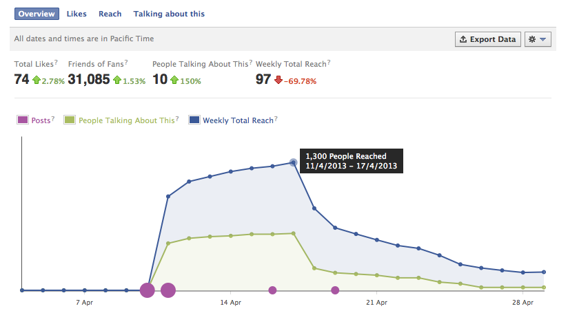
It was then down to the sharing and plugging of the page to gain followers of the project, something which friends and campaign groups I had previously contacted helped me out with. Here is the chart demonstrating page statistics from when the page was setup until late April:
I plan to continue the use and promotion of these pages over the course of the project, helping me reach larger audiences to help raise awareness for these political prisoners.
